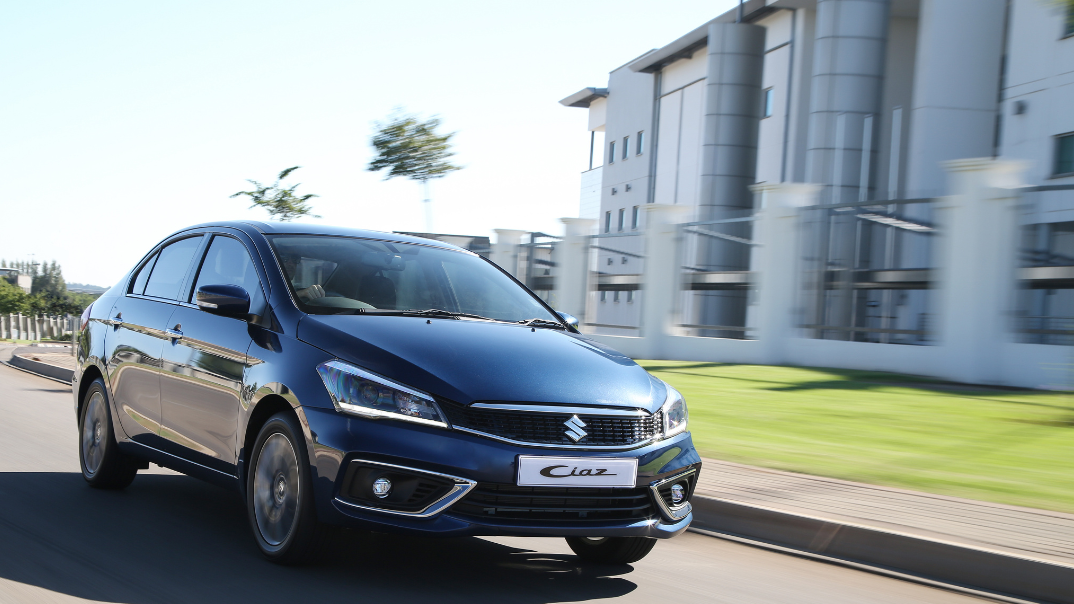
Few car manufacturers find the right balance between stylish and functional – here’s why Suzuki is winning the interior design game.
Let’s face it: everybody loves a hot car. Even if you don’t know your pistons from your gaskets, you still don’t want to drive a dull car. The problem is that most people, even the petrol heads, tend to forget about the most important aspect of any vehicle – the interior – until it’s too late. As a result, a terrifying number of buyers find themselves stuck with a car that they find very frustrating to drive.
This is one of the many reasons why Suzuki’s popularity has seen a steady increase over the past few years – they seem to have nailed the recipe for cabin designs that appeal across the board. Because that’s the thing: just like some people prefer sandwiches to pizza, some car buyers want a button for every function whilst other want a fully integrated console. So how do you keep everyone happy?
Keep it logical
Suzuki’s solution is to keep their interior design stylish, but simple. They don’t fall into the ‘overdoing’ trap that gets so many manufacturers in trouble – everything in a Suzuki interior has a necessary function – nothing is there just for show. When you spend a lot of time behind the wheel, this is a much-appreciated concept. Suzuki knows you only need one easy way to change radio stations or adjust the temperature – not seven different ways to do both at the same time. By keeping things simple Suzuki also keeps their interior design fresh and contemporary. Sleek always looks good!
Comfort first
Suzuki’s interiors are superbly comfortable all the way from the Swift to the Grand Vitara. Suzuki manages this by keeping everything within easy reach, and prioritising the functions we use most while driving. Creativity is a virtue, but not when you can’t find your hazards in an emergency.
Shape matters
One common complaint that many vehicle owners have is that they struggle to find certain functions at a glance. Many people assume this has something to do with markings or colours, but in truth it has much more to do with shape. You’ll notice that Suzuki consoles rarely have more than two shapes (square buttons and round dials) – this makes it much easier to quickly glance down to check where something is. A wide variety of shapes becomes confusing and requires drivers to look away from the road for longer. All these tiny details play a huge role in the overall driving experience, and Suzuki have these down to a fine art.
Allocate your space
A brilliantly-designed vehicle cabin is not just about having a lot of space – it’s about having the right type of space. Every Suzuki has a variety of storage spaces to suit different items (yes, including cup holders). It’s a fairly safe assumption that most people drive with a ‘universal’ list of items such as keys and cell phones. And there are few things as irritating as keys and cell phones sliding or rattling around as you drive. The Suzuki Baleno’s interior is a prime example of the perfect mix of compact storage spaces for small items interspersed with larger spaces, such as door pockets, for larger items. And they’re all within easy reach, which is crucial for safe driving.
One of the reasons it’s so important to thoroughly test drive any car, is to ensure you can live with it for years to come. It’s clear that Suzuki understands the needs of regular drivers – it shines through in the clever use of cabin space. If you’re in the market for a new car, make sure you pay close attention to interior detail. And while you’re at it, swing by your local Suzuki dealership for a test drive – you’ll find there must be a reason we’ve been named ‘Brand of the Year by our consumers’.
Book a test drive in your favourite Suzuki today and experience the Suzuki way of life for yourself!


![Are you a good driver? [quiz]](https://blog.suzukiauto.co.za/hubfs/Untitled%20design%20%2892%29.png)